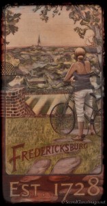
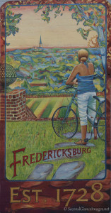
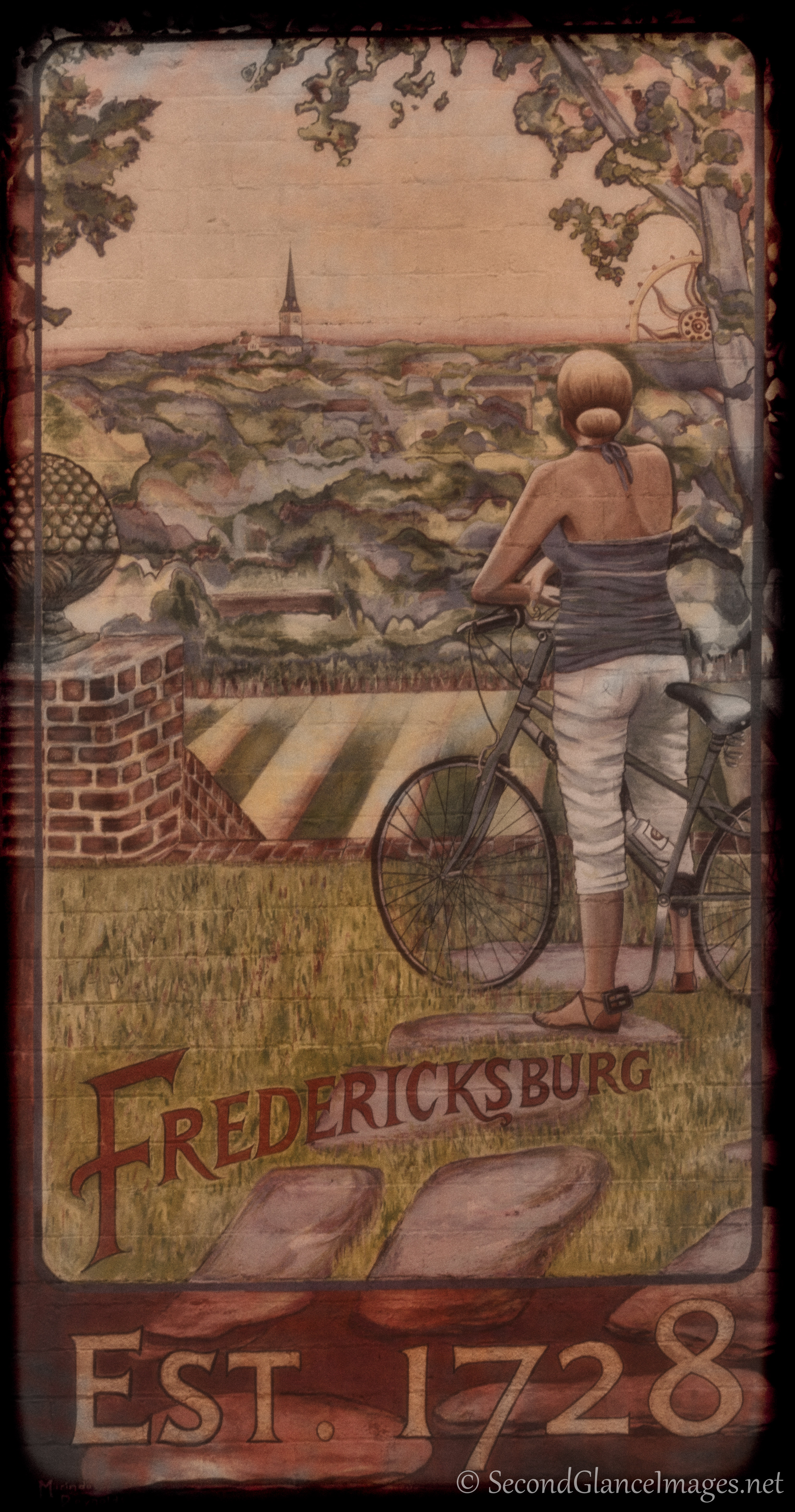
For today’s image, I picked a photo of a mural in downtown Fredericksburg. If not for the modern bicycle and the clothing, it could have been an old postcard. So that’s exactly what I chose to work toward in the post processing. After adjusting and cropping the image to just the mural, I duplicated the original layer. To this layer, I added the dark uneven border, shifted the colors to rich yet more traditional hues, added grain and then “washed out” the color just a bit. I then duplicated this new layer and converted it to a lower contrast B&W and set the opacity at 65%. I then used a soft brush eraser and randomly swirled away some of the layer to allow more of the color through. I’ve included a copy captured after the cropping for comparison.


